Pasta is one the most basic and consumed foods in the world, one just mix flour and water and it is ready. There’s little ways to innovate when the subject is pasta packaging, right? Wrong! Meet here the news.
The packages developed by designer Russian Nikita caused frisson in internet recently. The packs depicting women with different hair types are represented by different types of pasta and aims to encourage them to accept their natural hair. The box of spaghetti represents the straight hair, the fettuccine to the curly ones and the catavappi in a black-power. Besides being beautiful and standing out on the shelves of supermarkets, it also send a women empowering message without saying a single word.

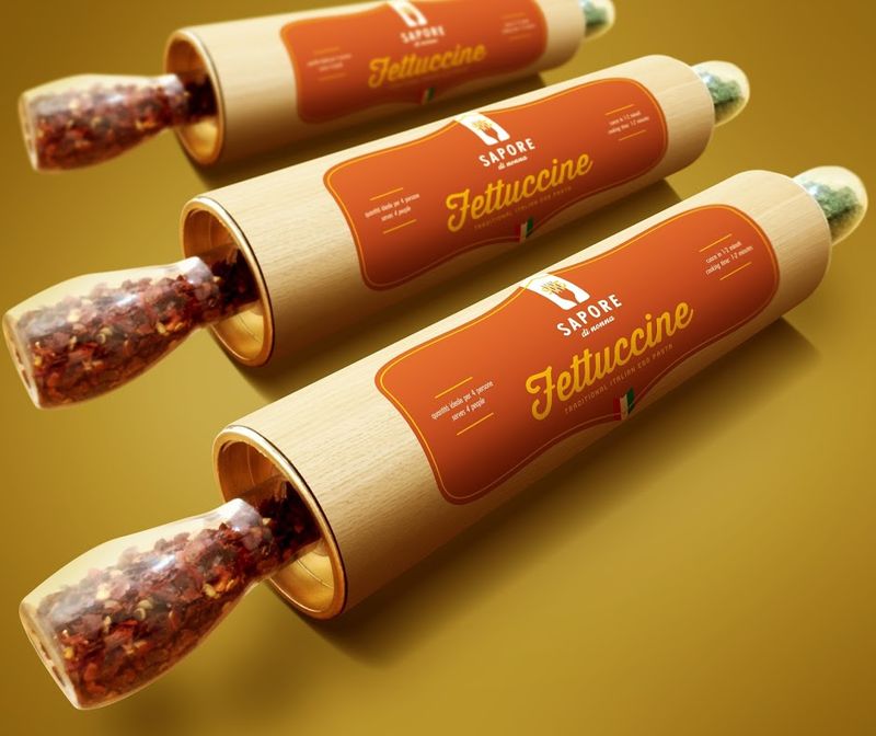
In the spotlight now is the packaging of the brand Sapori di Nonna, created by Brazilian designer Breno Cardoso. The pasta comes within a pasta roller and roller holders contains the spices to be used in culinary preparation. This is another packaging so beautiful that can even be stored and reused.


Innovative designs of pasta packaging are not exactly new, from time to time different box show up. In 2010 the British student Alex Creamer drew a box in honor of the city of New York with one of its buildings-symbol, the Chrysler Building formed by own dough to fit the lid underneath the box.

In 2012 the Studio Fresh Chicken has created a nice chef dressing pasta for the Italian brand Pietro Gala.

The packaging is important and the content is even better. Do you know more innovative design? Please share with us.
References: Geek Publicitário, Packaging of the World, The Dieline, Trend Hunter

